

Nest Brush is a self-dispensing, refillable, silicone toothbrush with an ergonomic design specifically adapted to your on-the-go lifestyle. Nest Brush is currently fundraising for further development of its products. With no dedicated website to purchase its products.
An e-commerce experience that has a high task success rate to purchase Nest Brush products.
Nick Jones & Walker Otte
UI/UX Designer & User Researcher
6 weeks
Learning Online Shoppers Frustrations
Walker Otte and I conducted a Google survey to reach a broad audience at a low cost to understand users' motivations for buying oral care products online. We also wanted to understand what services users wanted while shopping online for oral care products. Most importantly we were after our user's frustrations with the e-commerce experience.


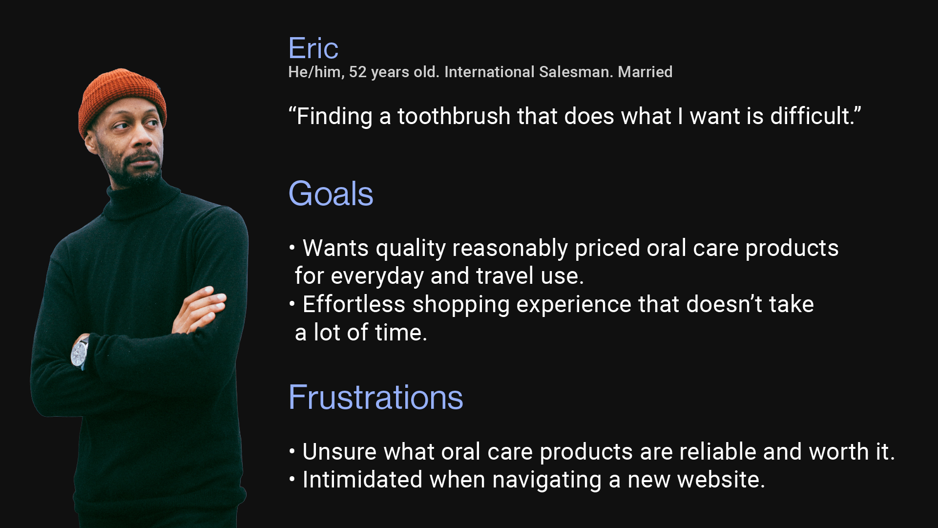
From our survey results, Walker and I felt like we knew our user's frustrations however we didn't quite know their motivations yet. We decided to construct a user persona based on 4 people we interviewed who took our survey. We learned that users want an easy shopping experience where they can trust the product.
Bad online shopping experiences can hurt the business if the user does not enjoy or understand how to navigate and purchase the product.
This matters because if the user doesn't know or feels uncomfortable using Nest Brush's website. Then the business will see lower sales and user retention.
Knowing our user's biggest frustrations when shopping online. We can make sure our brainstorming is effective by setting these criteria. Is this easy to navigate and not overwhelming, is this slowing down the website, and does this feel safe and trustworthy to use?
We knew this was going to be an e-commerce website so we started to establish our information architecture to act as our blueprint. Since this was a team project to avoid confusion as to what needed to be completed. This was a crucial step for us to stay on task and on time for creating an e-commerce website for Nest Brush. This also helped us by figuring out the necessary path for our users to have an easy and fast experience to purchase a product from Nest Brush.

Walker and I did how might we's to ideate possible solutions for our users' main pain points. HMWs were important to our design process because they allowed us to collaborate and piggyback off our ideas to come up with potential solutions for our user's pain points. This affected the design by being aware there might be multiple answers to a solution.

The purpose of creating our paper prototypes was to create rapid iterations for our tight deadline, keep our costs low, and increase our creativity to see if we came up with new solutions for our user's pain points. That couldn't be done in the HMW stage. We learned that creating multiple iterations quickly yielded better design solutions that target our user's pain points.


Walker and I did 4 user tests to see if people had any difficulties navigating and understanding the website. Our main goal for the user tests was to see if any pain points came up along the tests. If we discovered a pain point in the e-commerce experience still existed. It affected the design process by going back and figuring out a new solution for the pain point.

By simplifying the product page users can understand quicker and continue their shopping experience without any frustrations. We also decided to add suggested items here to speed up the process of users having to go to different product pages to buy multiple things.
By removing suggested items from the cart we can build trust in continuing the checkout process. If they feel like they can trust this step it can also increase the speed of the user's checking out.


Adding an edit button to change previous information can create a faster website experience. Having the option to undo a mistake makes the user feel like they aren't locked in and can help build trust at the checkout.
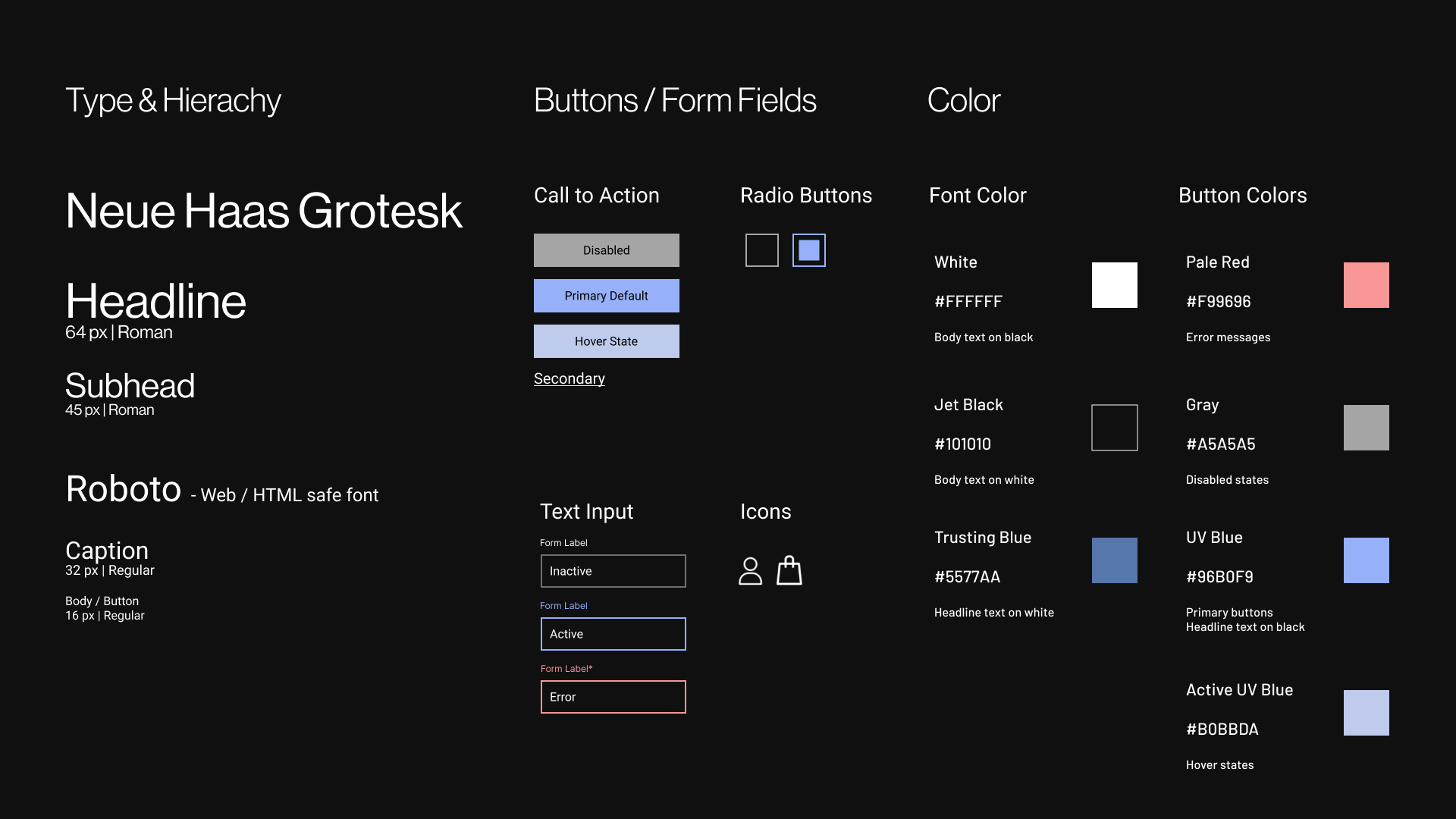
Walker and I looked into color psychology and learned blue is the most trusting color. This affected the design by adding blue to our active states to build trust continuing forward. The blue we chose is the light when the toothbrush is in the charging dock. The typography choice was Neue Haas Grotesk for the modern feel it has similar to how Nest Brush products look modern. We chose Roboto as our main body type since it was a web-safe font causing loading times to be lower rather than sticking with Neue Haas Grotesk for the body copy.
We focused on making the product page easy to understand and not giving too many options to our users. This allowed the user to focus on what the product is and how to purchase a product. We found that 5 out of 5 users could understand what was being shown on screen and felt comfortable proceeding to the bag.

By removing the suggested items from the cart. Users were no longer questioning what was in their cart allowing us to ease their pain points of trust and speed when shopping online.

With the edit button added user's felt more safe knowing they can go back and check their information while checking out. This also increased their speed by not having to restart if they input incorrect information.

It's important to balance business needs and user needs. Overall creating a solid user experience is good for business. Working in a team can create a fun dynamic as well as more creative user-centered solutions.
Nest Brush has been fine-tuned to the point where Walker and I are satisfied with the final product. The next step would be to translate our desktop screens to mobile.